Welcome, Seattle Kraken.
Last week in Seattle, a moment of brightness emerged from the murky depths of the global pandemic. The newest NHL franchise finally unveiled its logo, colors and team name to the hockey world — the Seattle Kraken.
Naming a hockey team after a mythological sea creature from Scandinavian folk lore (not to mention a few cheesy Hollywood movies) may be ridiculously campy — but it’s also a bold move and just so damn cool.
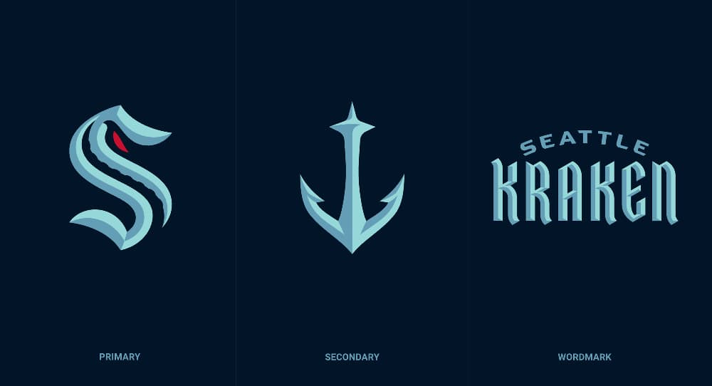
The execution of the brand is sharp and crisp, and it doesn’t disappoint. I applaud whoever resisted the temptation to create a full-on monstrous squid illustration, as numerous fan-created iterations had done prior to the reveal. Sure, it may have been bad-ass looking, but it’s the absence of such an element that makes the logo all the more dramatic and foreboding (see 1975’s “JAWS”).

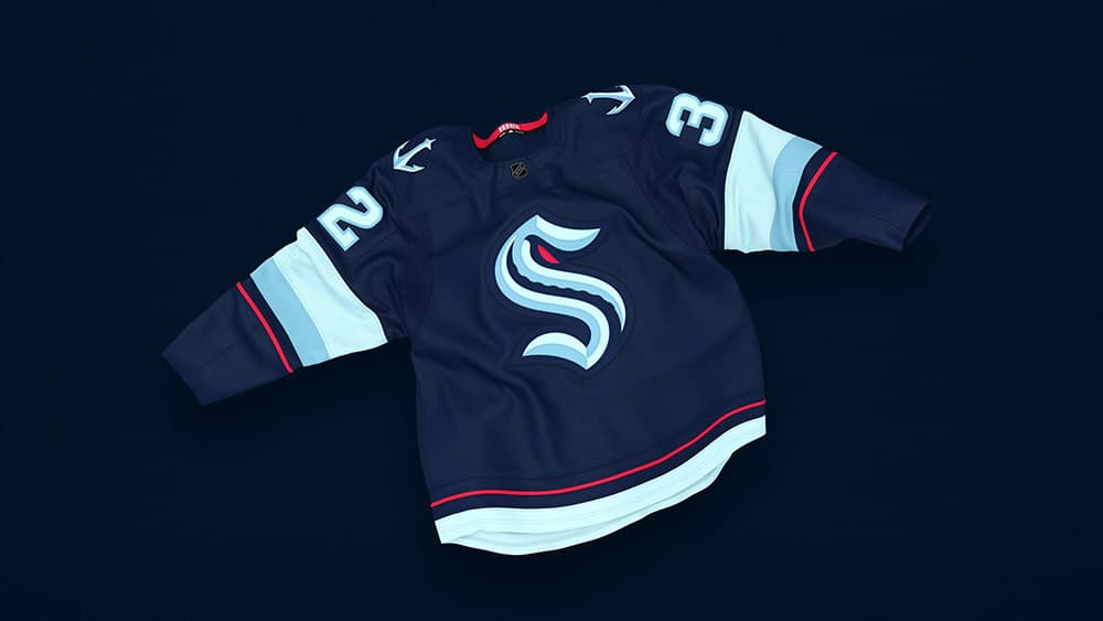
The “S” primary logo is a nice nod to Seattle’s original pro hockey team, the Metropolitans. However, it’s the details within the letterform that make this mark so appealing. The single tentacle twisting up the “S” is an excellent use of negative space. The ominous red eye feels just right. Four shades of blue make the color palette distinctly Seattle. Add to this a secondary logo that wonderfully melds a ship’s anchor with the iconic Space Needle, and you’ve got the makings of a solid visual brand. All that’s left is to take to the ice.
This future hockey fanatic can’t wait for 2021.

Charlie’s Posts
07.28.2020 Welcome, Seattle Kraken.
01.18.2019 Reindeer can fly. Woodchucks too.
10.20.2017 BlackWing On Hand as a New Era Begins for Alaska Air Cargo.


